

Numbers and statistics are the ultimate truth with the condition that they are presented neutrally. Numbers can be very simple to understand yet there are numerous methods available to manipulate their representation which can fool anyone if not everyone.
Ronald Coase who is author of the famous book How to Lie with statistics correctly said, “If you torture a data long enough, it will confess to anything”.
Proper understanding of the numbers and their representation can help us to catch the hidden perspective, and this can also be used to build the perspective if you are on the other side.
Below are few terms which are most important for presenting the numbers. These are being used for ages.
Perspective
In most cases, the perspective is more valued than the underlying information.
There is one story that everyone might be aware of, this story teaches us the importance of perspective. The story goes as, once a king asked astrologer to tell his future, Astrologer examined his hand and told him that all his family going to die in front of him. This made the king angry, and he sentenced the astrologer to the death penalty. Birbal who was minister observed this and he asked the king that he knows one excellent astrologer, if the king approves, he will bring him in the next day. The king who was already worried instantly approved it. The next day one astrologer came to the court and told that Birbal sent him. King immediately called him and shown his hand, this time astrologer said, “O mighty King you are gifted with very long life, longest in your family”. This time king got delighted and immediately awarded the astrologer. After this astrologer removed his makeup and turns out as Birbal. Birbal then reminded the prediction of the astrologer whom King sentenced to death; both the predictions were the same. With this king understood his mistake and freed the original astrologer.
Here we can see a single number which is the age prediction of the king can be presented in 2 different perspectives both are correct, yet they are understood very distinctively. Now imagine if we have a huge data set, what kind of perspective someone builds with it.
Representation
With the improved technologies and the advancement in IT space, we got enormous processing power to slice and dice the data. This gives us numerous options to represent the data.
A. Full data with influenced formatting:
In this method the entire data is shown, the catch here is the formatting.
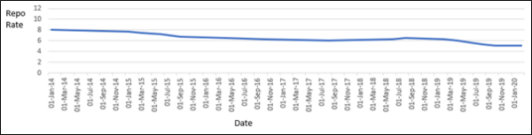
Let’s take an example of the RBI repo rate for the last 6 years:
a. Representation 1: (Intention is to show there is NOT much change in repo rate over the years)
b. Representation 2: (Intention is to show major changes in Repo Rate)
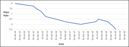
Both charts are showing the same data, both are accurate the only difference here is the axis manipulation. We cannot say ethically this is right or wrong but legally both practices are valid.
B. Partial data:
It is twice as hard to crush a half-truth as a whole lie. In the case of statistics, it is even more difficult to catch the half-truth. See how the same data is represented in a different manner.
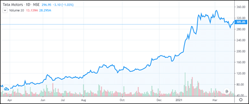
Representation 1
See the following example, (Source: moneycontrol.com). If you check the following example the share of Tata Motors gave an extraordinary return (221%).
Representation 2
Check the chart for the same share. There are below the average returns (-235%).

Both the charts are accurate, the first one has got partial information. If some broker wants you to buy Tata motors blindly then he will show you the first chart. If the broker is neutral, then he will show you chart 2.
C. Statistical tricks
If one knows what picture to paint then statistics is the best canvas for someone who understands the numbers. For example, if look at one organization that employs 20 people. Out of these 20, we have the following salary breakup:
- 15 People earning 100$ a week
- 4 People who might be supervisors are earning 1000$ a week
- Owner of a company also getting 10000$ per week compensation.
Let’s see few statistical numbers with this data:
- Average or Mean salary is 775
- Median/Mode salary is 100
- Variance is 4,606,875
- The standard deviation is 2146
Here we are getting all ranges of figures if a reporter wants to display that all the employees are well paid then it will put down the Average salary whereas median/mode can be used to show number 100 as a weekly salary for the majority of people in the group. This example highlights how the outlier (a value that is totally out of bound comparing to the rest of the values) is effectively used to manipulate the numbers.
D. Knowing the context.
Sometimes knowing the context is very much important. If we take the case of some rare disease, there are only 1% chances of any person having it. This also means that there are 99% chances that a normal person not having it.
Now if someone claims that he invented the the machine 99% accuracy, which can tell if the person has the disease or not by just taking a picture of the person. This sounds magnificent but when we look at the context and probability, we can easily understand the claims are correct, but the machine is useless.
E. Survey:
Nowadays there are numerous surveys coming in numerous subjects. Many of these are meant for image building, setting up the impression, etc. of course, there many genuine surveys are out there. Irrespective of how the survey is, for the audience, it’s almost impossible to understand the motive behind it.
How the surveys are mocked up:
- They are completely based on imagination.
- Selective surveys: There are always a group of people present who are in favor or in oppose of the subject. If the survey contains more percentage of any of these groups, then it will put their point forward. Ideally, the representation of a group in a survey is proportional to their actual percentage in the population.
- Design: This is a very recent addition but it’s most difficult to catch and decrypt. How the surveys are designed can also put forward the hidden agenda without notice.
Let’s take an example: There is a survey for some upcoming general election, and the objective is to find who wins this election. There are two main candidates A who is currently serving the post and B is the main opponent.
Questions in this survey are: (Assume that we cannot ask whom you will vote for)
- Are you happy with the performance of candidate A?
- Your opinion on some current affairs?
- Do you like A?
- Do you like B?
This survey looking good even though it is biased if the respondent is having slight negative views on candidate A then the survey will go in favor of candidate B even if respondents don’t believe/support candidate B.
To get the correct opinion we need to add a few sub-questions as below.
- Are you happy with the performance of candidate A?
- If the answer is “No” -> Do you think B would have performed better or handled the situation better?
- Your opinion on some current affairs.
- If there are negative answers -> then ask if candidate B would have made any difference.
Conclusions
Looking at all of these, the following are the main points to consider while looking at numbers, stats, and reports, etc.
- Data Literacy is a must for everyone. At least basic data literacy is needed for someone who works on data or who uses the data for decision making. Data literacy can be defined as “The ability to read, understand, argue with, and make decisions from information”.
- Always try to see the complete picture.
- While looking at any report give the stress on following points:
- Reporting period.
- Measurement units used (they should be the same across the report).
- Axis manipulation.
- Proportion.
- Selection of the charts.
- In case of any aggregate numbers check the following
- Any outliers present in the data.
- Mean, mode, median, standard deviation if any of these values are present then check the rest of the values.
- For Survey’s and opinions, only take it into consideration when the following points are transparent
- The number of participants is considerable comparing the total group.
- Either survey should be random or a clear idea of the participant groups is needed.
- The survey questions should be unbiased.
In this era of data, it is most important to choose the best partners for the data implementation who can either help you in catching biased representation of data or represent the data to you neutrally.
